Grocery TV Website
UI/UX Design | 2023
Led a full website refresh, revamping UI/UX and translating the new brand direction into a cohesive, user-centric digital experience—improving engagement and increasing site sessions by 67% YoY.
Overview
Grocery TV is the leading in-store retail media platform, partnering with 120+ retailers across 6,500 stores to modernize shopping experiences and drive incremental revenue. Reaching 1 in 4 Americans where 90% of purchases happen, Grocery TV simplifies in-store media so retailers can focus on serving their customers.
As Grocery TV scaled, our existing website no longer clearly represented our brand’s evolving focus. The refresh aimed to:
Improve clarity around our offering and industry.
Simplify navigation and storytelling for dual audiences.
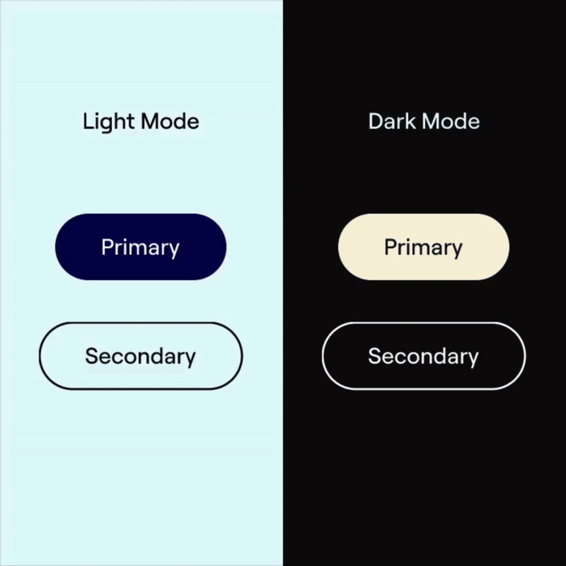
Reflect a more modern, credible, and professional brand identity.
Process
The goal was to create a more intuitive, visually-engaging experience that would resonate with both brands and retailers. This was accomplished by:
Collaborating with retail and media sales to understand current pain points and frequent questions in client meetings.
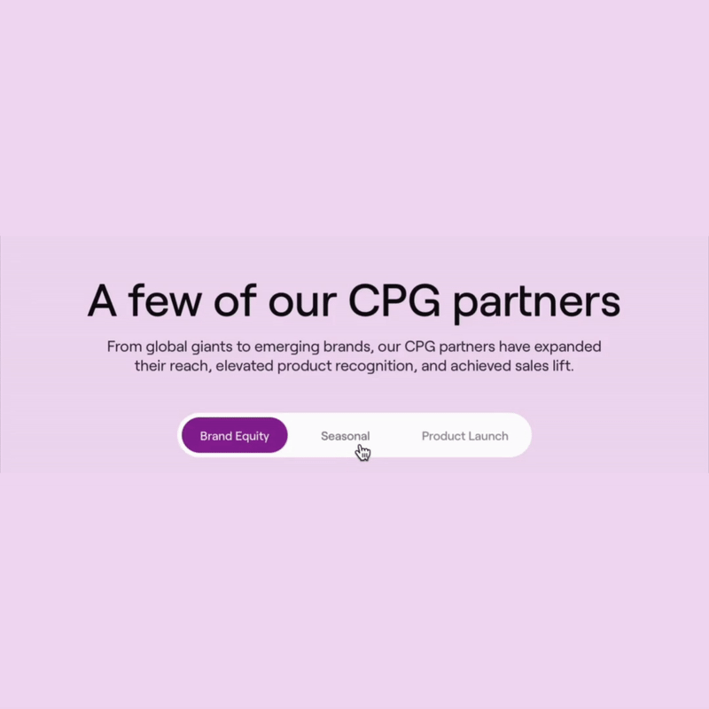
Incorporating more imagery and videos to show how our products appear in-store and how brands can work with us— giving visitors contextual understanding at a glance.
Leveraging Google Analytics to understand how users navigated the website and pinpointed key areas where visitors dropped off.
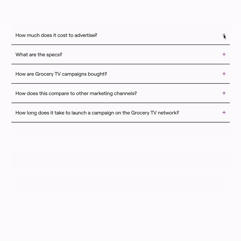
Structuring the site content to proactively answer high-level inquiries to help improve user understanding and engagement.
Insights
This project was a balancing act between where the company was and where it was headed. At the time, our offering was still evolving, so we needed to communicate value without overcommitting to specifics — a challenge that shaped how we framed content across the site.
We were also designing for two distinct audiences: retailers and advertisers. I restructured the site’s flow and messaging to be clear and intuitive, no matter who landed on the site first. This reframing helped reduce friction and support more meaningful engagement across the board.
Lastly, this project reinforced the value of scalable systems. I built reusable components and templates that not only streamlined future updates but also empowered other teams to contribute confidently while maintaining consistency as the brand continues to grow.